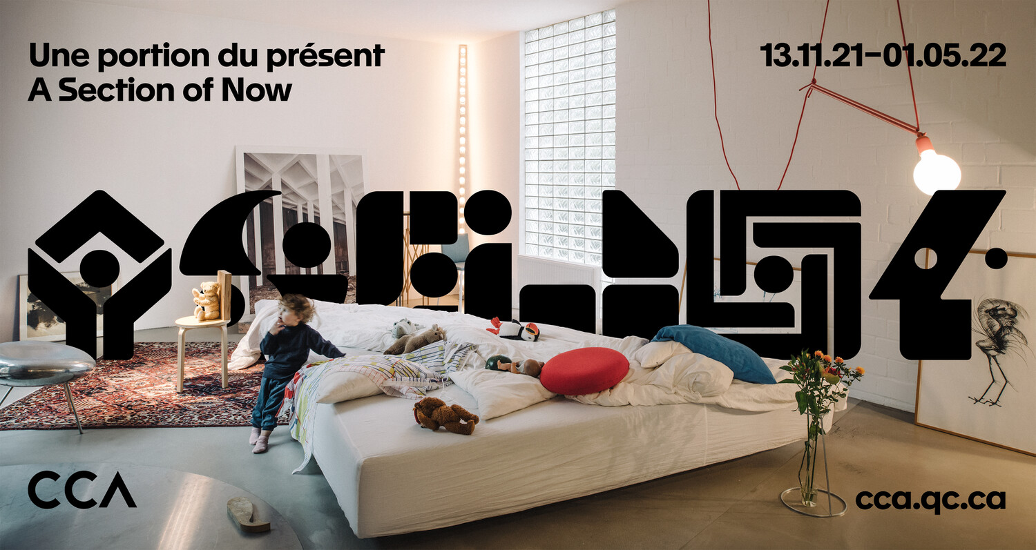
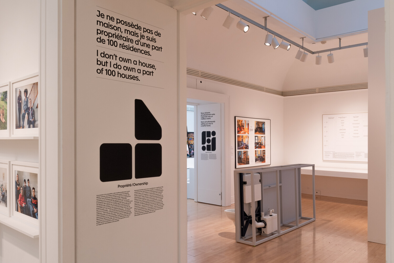
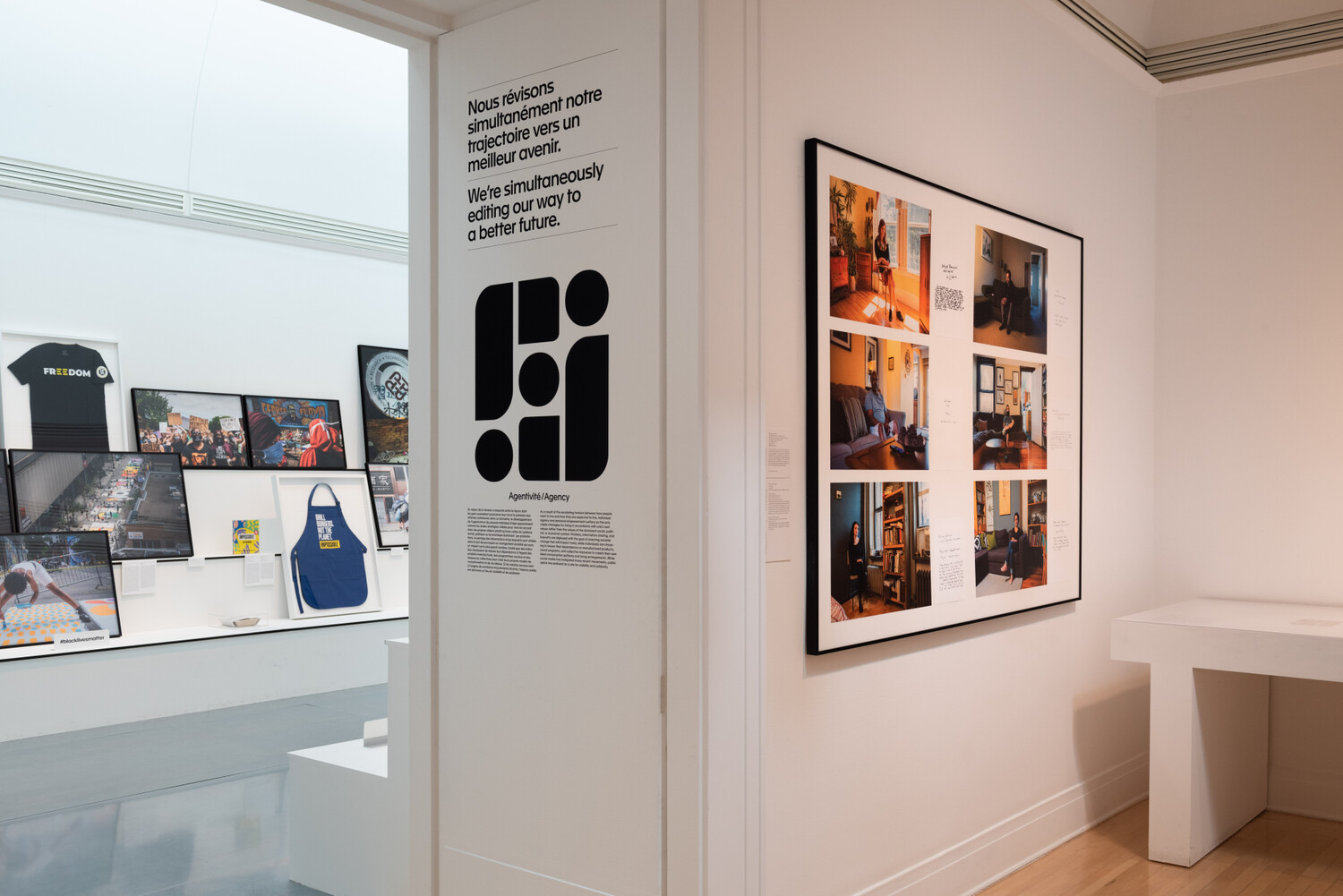
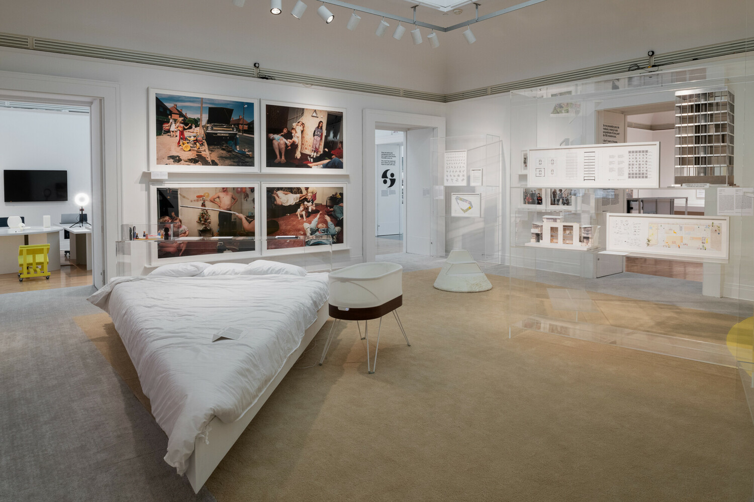
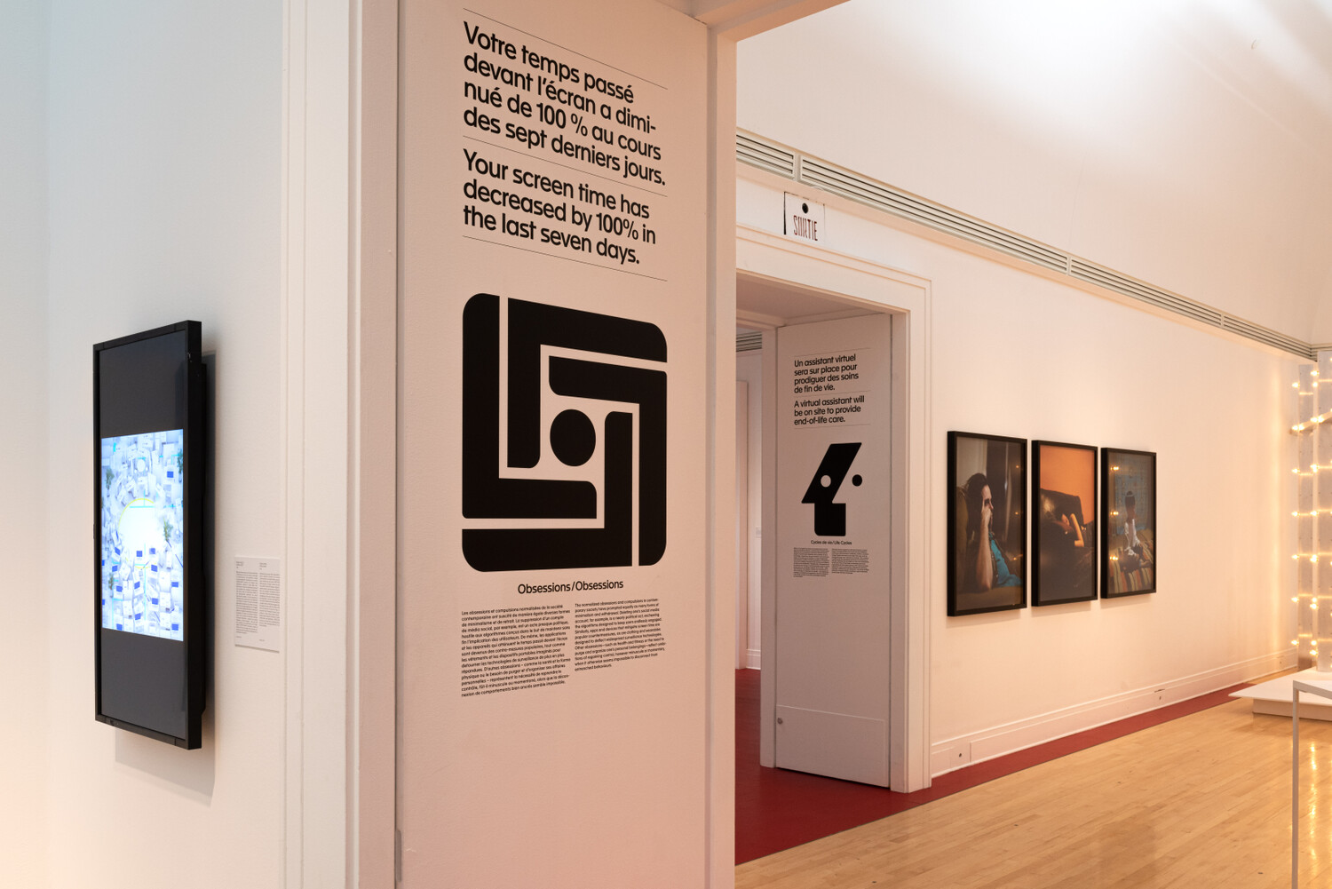
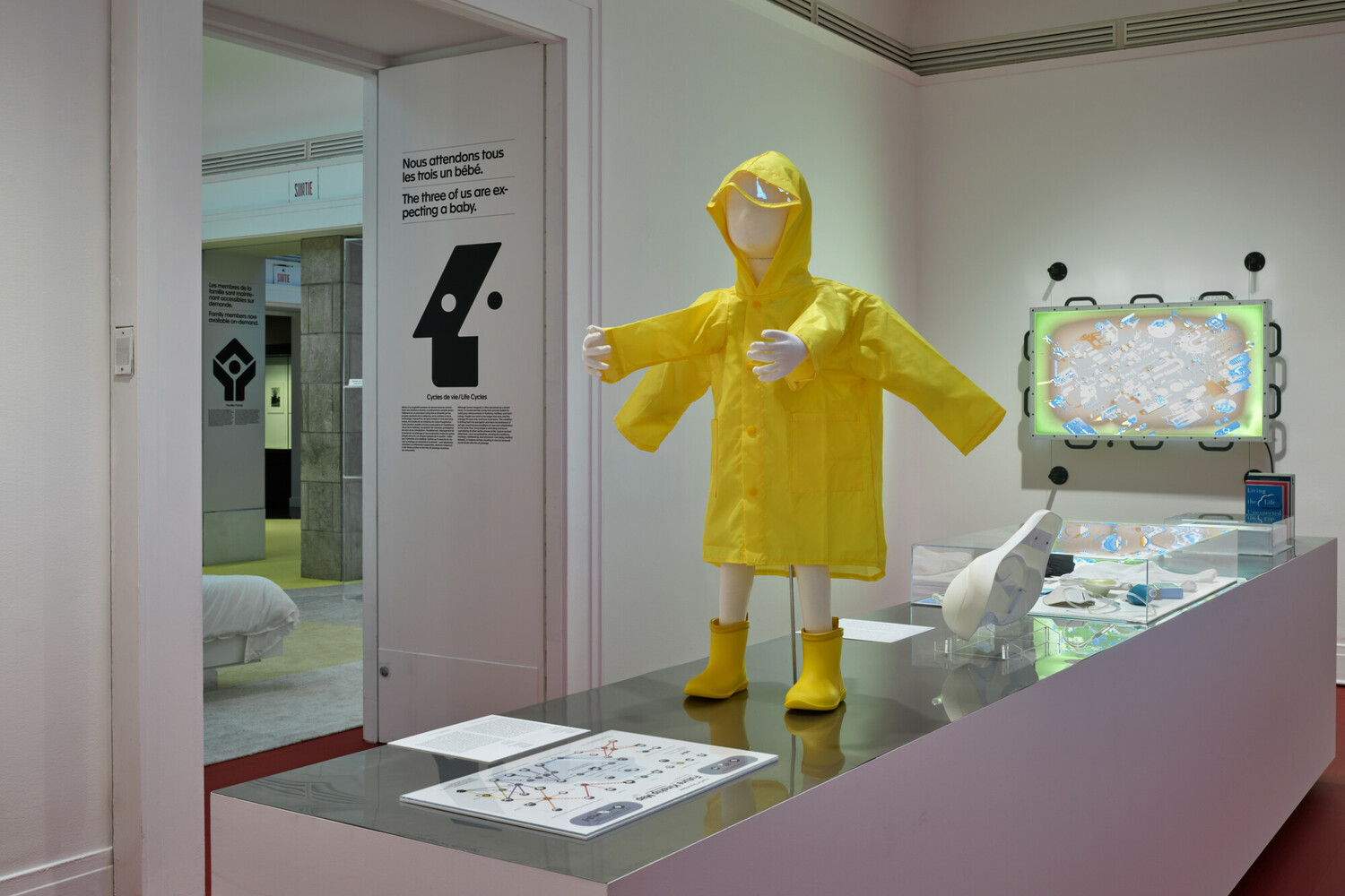
In 2021, the Canadian Centre for Architecture opened A Section of Now, an exhibition examining contemporary social life through six contested themes: family, property ownership, activism, labor, obsession, and life cycle. The curator's frame was explicit — the show "shares its findings without moral judgment." Fifty contributors. Four years of development, interrupted by a pandemic that made every topic more urgent.
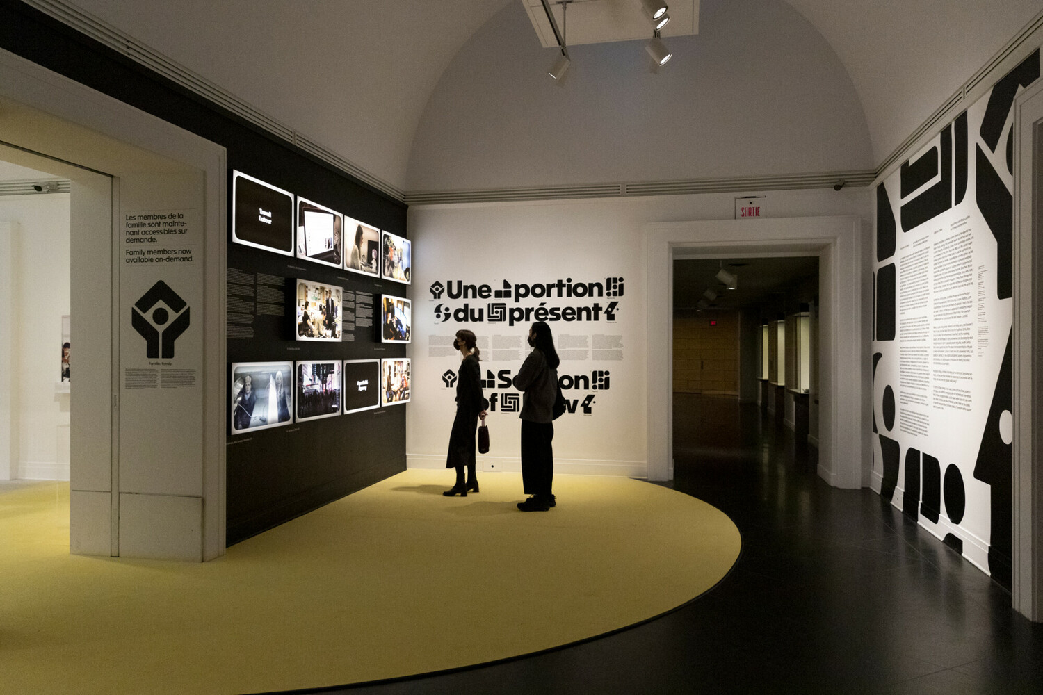
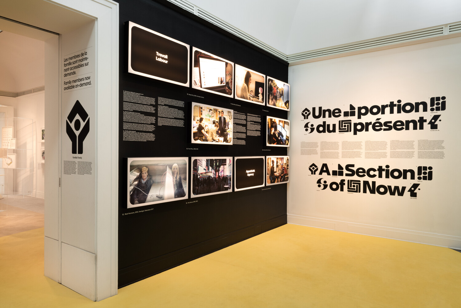
Folder designed the exhibition identity, wayfinding, a 350-page bilingual publication co-published with Spector Books, and the Catching Up with Life website — the digital platform that extended the investigation beyond the gallery. Exhibition design by Sam Chermayeff Office.
This case study draws from Symboles, a panel discussion hosted by Giovanna Borasi at the CCA during the exhibition opening.
You can't design a pictogram for "family."
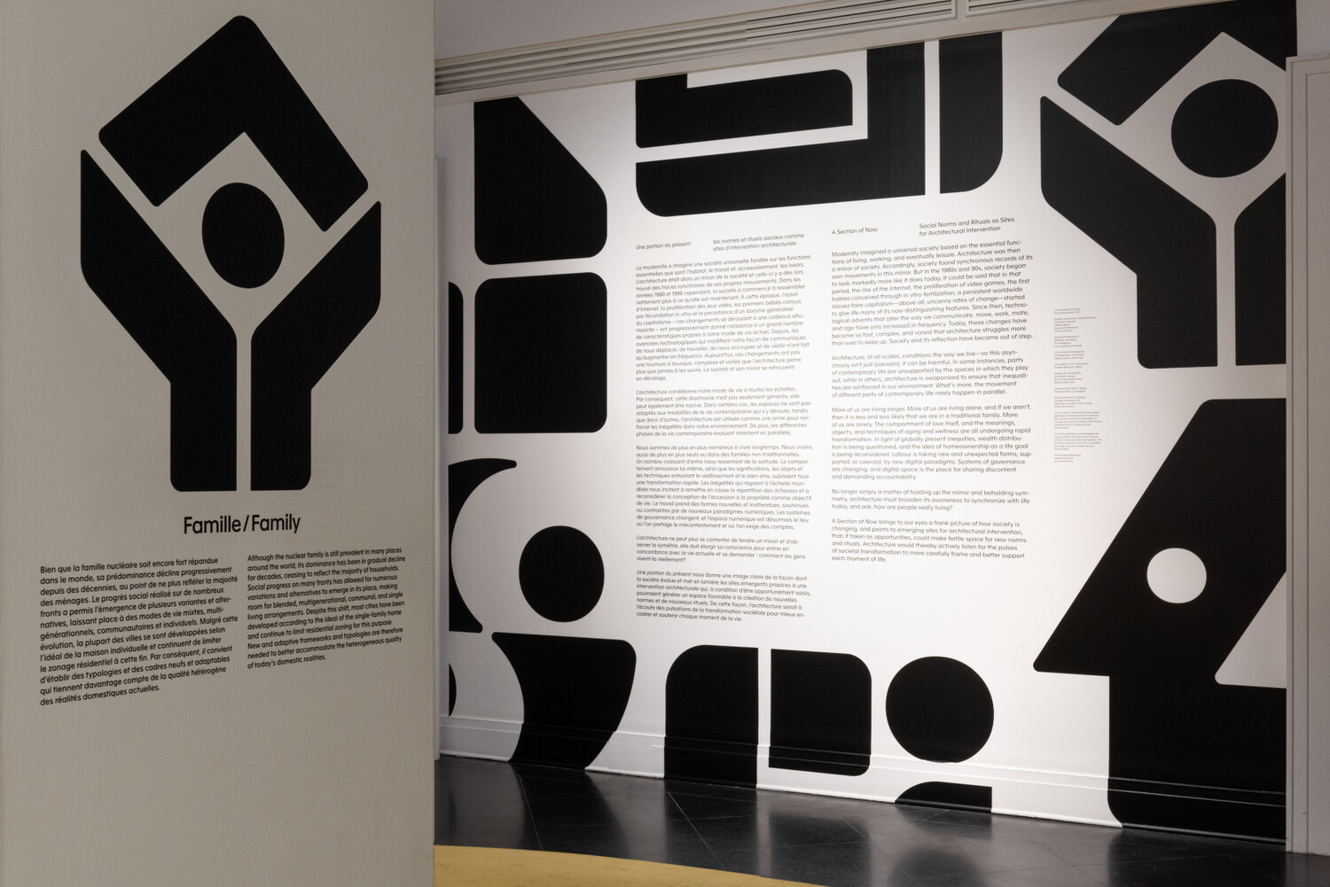
Or rather, you can — two adults, two children — but you've already answered the question. Family as nuclear unit, the 1950s version, one answer from a field that includes chosen family, multigenerational households, single-parent households, LGBTQ+ families, families separated by deportation, domestic labor, the family as economic unit, inheritance, care networks. And then the overlaps: family into ownership (the family home), family into labor (care work), family into life cycle (aging parents, children leaving).
The brief asked for a navigational system that organized without editorializing. Working from the simplified version of each concept is fast, but it lies. Working from the full contested field — doing this for all six themes simultaneously — made the scope of the problem visible. The abstract form wasn't a stylistic choice. It was the only form that could hold the inventory.
The ambiguous solution required more information than the pointed one, not less.
The icons look like the era they're examining.
Preparing the economic model diagrams for gallery three — visual explanations of how different economic systems structure incentives — sent us deep into when the forces the show examines actually took shape. The shareholder model didn't catch on until the 1990s. The nuclear family as idealized social unit is a postwar construct — the building block of the consumer capitalism the 1960s and 70s produced and the show holds under a microscope.
That era has a visual identity: the international style of corporate mark-making. Abstract, authoritative, systematic. Otl Aicher. Chermayeff & Geismar. The project of giving institutions visual authority that felt neutral and inevitable.
The icons look like they came from that era because the show is about what that era produced. Not stylistic nostalgia — the visual DNA of the forces being examined, borrowed and made slightly strange.
Icons disguised as logos.
"In my mind, they're icons disguised as logos. Logos are meant to exist outside of general context, but these don't function at all outside of the context of this show."
Logos claim authority that travels — they mean institution, wherever they appear. These forms wear that register while being entirely dependent on the show's context. You recognize the visual language — the authority, the abstraction, the systematic feel — without being able to decode what it points to. First read: of course, that makes sense. Second read: wait, does it?
That discomfort was a design goal from the beginning.